On this page

A brand style guide keeps an organization's visual and verbal identity consistent across every touchpoint, from marketing presentations to sales decks, and internal communications. When teams work from a shared set of brand standards, every piece of content reinforces the same message and visual identity.
Learn how to create a brand style guide and distribute brand assets, so every presentation stays consistent. Start creating polished, on-brand slides with a presentation maker like Microsoft PowerPoint.
What should brand guides include?
A good brand style guide covers both visual and verbal identity. It sets the rules that keep content consistent across every format and channel.
Several groups rely on brand guides to do their work effectively. New and existing employees need clear direction on how to represent the organization in presentations, documents, and communications. Agencies and contractors create content on behalf of the brand and need access to approved assets and standards. Brand partners and sponsors may feature the brand in co-marketing materials and need guidance on proper usage.
A strong brand guide typically includes these core elements:
Core brand identity
Logo and usage guidelines
Color palette
Brand fonts
Tone of voice and messaging
Real-life examples
Digital assets

Key elements to create a brand style presentation
1. Define the core brand identity
The opening slides of a brand style guide should establish the foundation. This section of the style guide serves as a source of truth for newcomers joining the organization and for anyone who needs to represent the brand externally. When the core identity is clear, teams can make better decisions about how to communicate, even in situations that brand standards do not explicitly address. Clarify these points in the section:
Brand purpose: why does the brand exist?
Mission and vision statement: what does the brand do and want to achieve?
Core values: what are the guiding principles?
Brand personality: what human traits does it embody?
2. Share logo, image, and icon guidelines
The next few slides should focus on appropriate logo use and image use. Start by presenting the primary logo along with approved variations for different contexts, such as horizontal and stacked versions, monochrome options, and simplified icons for small spaces. Clearly define what not to do which may include distorting proportions, changing colors, or placing the logo on busy backgrounds.
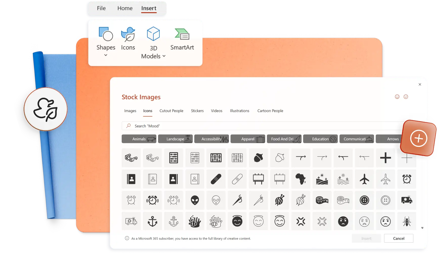
Images can be layered on slides to show logo size and proportions for different types of communication, including presentation slides, letterheads, and video marketing posts. Include guidance on brand icons as well, specifying the style, line weight, and visual treatment that fits the brand.
PowerPoint SmartArt offers a simple way to display do's and don'ts for visual guidelines. For brands that need high-quality imagery, Microsoft 365 provides access to the PowerPoint stock images and icon library directly from within the presentation maker.
3. Set the brand color palette
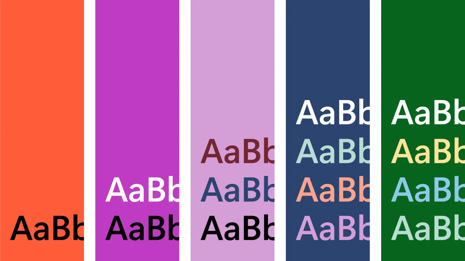
Color creates instant recognition. A consistent presentation color palette helps audiences associate specific hues with the brand over time.
Most brands work with three to four colors which include a primary color, one or two supporting colors, and an accent color used sparingly. The brand style guide should display each color as a visual swatch alongside its technical specifications, including PANTONE designation, CMYK percentages for print, and HEX and RGB codes for digital use.
In PowerPoint, teams can specify a theme color scheme that applies brand colors automatically to new slides. Teams can also create a reusable custom slide background that reinforces the color palette across every presentation.
4. Select the brand font
Typography shapes how audiences perceive a brand. A modern sans-serif font communicates something different than a traditional serif, and consistency in font usage strengthens brand recognition over time.
Most brands use two or three fonts which include one for headings, one for body text, and sometimes a third for accents like pull quotes or callouts. The brand style guide should specify each PowerPoint font along with details on size, spacing, and line height. Include examples showing how the fonts appear in different contexts, such as slide titles, body copy, and captions.
PowerPoint allows teams to upload custom fonts, so organizations with their own brand fonts can distribute their fonts across the company. Text styles can be defined within the Slide Master to ensure that every new text box defaults to the approved font settings.
5. Specify the tone of voice and messaging
Brand tone of voice defines how an organization sounds in writing. It shapes the personality that audiences perceive when they read content from the brand.
This section of the style guide should include a short tagline, an elevator pitch, and messaging pillars that guide content creation. Describe the tone of voice in concrete terms, such as confident but not arrogant, or helpful but not patronizing. Include style rules on specifics like contractions, punctuation, and emoji usage.
Teams can stay on brand with Copilot in PowerPoint, which can generate content from scratch or rewrite existing slide text to match the brand tone of voice guidelines.
6. Showcase real-life examples
Examples bring brand guidelines to life. They show how the rules translate into actual materials, making it easier for teams to understand what good looks like.
Include slides featuring real or mock examples of brand materials. These may include business cards, email signatures, social media posts, pitch decks, presentation slides, and certificates. Highlight how the logo, colors, fonts, and messaging work together in each format. This helps teams visualize brand standards in action and supports consistency across different communication formats.
For newer brands that do not yet have a library of examples, AI slide design suggestions from Copilot can help. Copilot recommends layouts that align with brand aesthetics, giving teams a starting point they can refine. This is useful when building a pitch deck or other high-visibility presentation.

7. Provide digital assets
A brand style guide is most useful when it connects directly to the assets teams need. Instead of describing where to find the logo, link to the actual file.
Include a slide with links to downloadable logos, color libraries, social media cover photos, favicons, meeting backgrounds, and presentation templates. Linking assets directly to the style guide reduces the risk of teams using outdated materials and saves time searching through folders.
PowerPoint offers seamless connection to OneDrive and SharePoint, making it easy to keep brand assets, images, and brand copy examples in a secure and accessible spot. Any updates to the source files will automatically reflect across the organization, keeping everyone updated.
How to create a brand guidelines template in PowerPoint
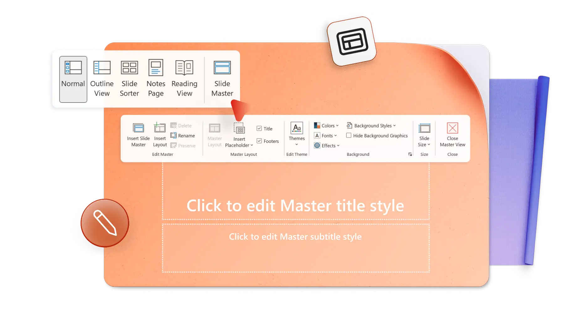
Learning how to make a style guide in PowerPoint starts with the slide master. This controls the global design for a presentation, applying brand elements consistently across all slides. This is the foundation for how to make a brand guide that teams can reuse.
Once set up, every new slide automatically inherits the correct colors, fonts, and logo placement, creating a brand-compliant workflow for all PowerPoint presentations. Here is how to set it up using the PowerPoint desktop app:
Open a PowerPoint presentation, then navigate to view, then select slide master to define global design settings
Apply brand colors by choosing themes, then enter the brand's HEX or RGB codes for each color and save as a custom color theme
Select fonts, then select customize fonts to add the approved heading and body fonts
Add the logo to the master slide, typically in the top-left or bottom-right corner so it appears across all slide layouts
Define slide layouts for common slide types, including title slides, content slides, and section dividers along with text and image placeholders for flexibility
Insert approved icons, shapes, or watermark backgrounds then apply any filters or overlays that match the brand style
Go to file, then save as, and select PowerPoint template (.potx) to save the template in OneDrive or a shared folder
Stay on brand with the Organization Asset Library
Organizations using Microsoft 365 can set up an Organization Asset Library (OAL) to store approved brand materials in one central location. Instead of uploading logos, icons, and images manually, teams can pull assets directly from this library.
This approach keeps presentations brand-compliant because teams always access the latest, approved assets. It also creates consistency across the company since every presentation draws from the same source. It's a big time-saver for employees as they don't need to hunt through folders or verify that a file is up to date.
To access the OAL library in PowerPoint, go to insert, then pictures, then stock images, and select organization assets (if enabled). From there, browse and insert approved logos, backgrounds, or icons directly into slides.
Get started with well-designed templates
Teams that are short on time or need a starting point can adapt a existing template to fit branding needs. Microsoft PowerPoint offers a library of presentation templates with professional layouts that can be customized with brand colors, fonts, and logos.
Starting with a template reduces time spent on design decisions and helps teams focus on content. Once customized, the template can be saved and distributed as the official brand presentation format. Explore adaptable templates for free on PowerPoint online.


Make impactful presentations in no time using simple design tools and Copilot in PowerPoint. To learn more ways to make branded presentations engaging, explore tips to make interactive presentations.
Frequently asked questions
What are the five brand guidelines?
The specifics vary by organization, but most brand guidelines cover five core areas. Logo usage defines placement, sizing, and restrictions for how the logo appears. Color palette specifies primary and secondary colors along with their technical codes. Typography establishes the approved fonts and hierarchy for headings, body text, and other contexts. Imagery style describes the approach to photography, icons, and graphics. Voice and tone outlines how the brand communicates in writing.
What is a brand guidelines template?
A brand guidelines template is a pre-designed document or presentation that organizes all brand rules into a structured format. It includes sections for colors, fonts, logos, and tone of voice. Templates make it easy to create consistent branding without starting from scratch and can be customized to fit any organization's needs.
What's the difference between a brand style guide and brand book?
A brand style guide is a practical document that outlines the rules for logo usage, colors, fonts, and tone of voice. Designers and marketers use it daily to keep their work on-brand. Brand books are broader and more strategic. It covers the brand story, mission, values, and positioning alongside visual guidelines.