On this page
A well-designed presentation keeps an audience focused and makes complex ideas easy to understand. Slide design choices like layout, color, typography, and visuals together influence if a presentation feels clear and professional or hard to follow. Applying good design principles can make a pitch deck feel polished or classroom presentation easy to consume.
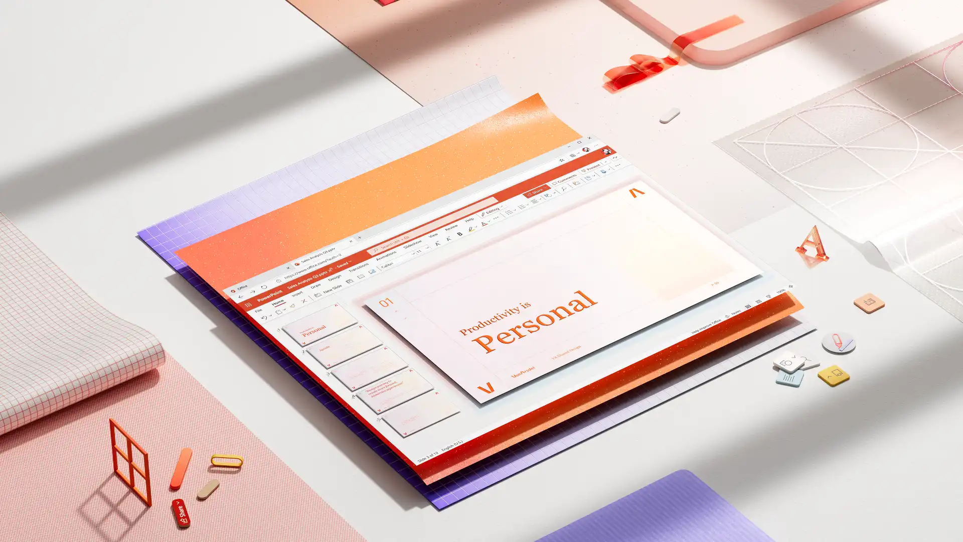
Learn how to design presentation slides that communicate clearly, with practical guidance on showcasing data and layouts for common slides, and review the design trends shaping presentations in 2026. Discover how to put ideas into action using Microsoft PowerPoint and features in the AI presentation designer that help anyone build impactful slides.
Presentation slide design and layout basics
Share one idea per slide
Build each slide around one clear idea or question. Slides communicate best when they deliver a single message, supported by written content and a suitable visual, like a graph or a high-quality stock image. Trying to fit multiple points onto one slide reduces the impact of the slide, particularly in cases like a pitch or quiz presentation. In such a case, split the message into two slides for clarity.
Leave intentional white space
White space is just as important as the content itself. It makes the content easier to read and draws attention to what matters. There's no need to fill every corner with text or graphics, as this can make slides look cluttered and difficult to follow.
Make decks that work without presenters
In 2026, most decks, especially business presentations, get shared asynchronously via email or Microsoft Teams, where there's no presenter to explain the point. Choose clear layouts, strong slide headlines, and draft speaker notes so that the slides can communicate the core message on their own.
Design for small screens
Presentations are also increasingly read on phones. Avoid dense columns and small text, and choose larger text, simpler layout choices, and high-contrast colors help slides read well at any size.
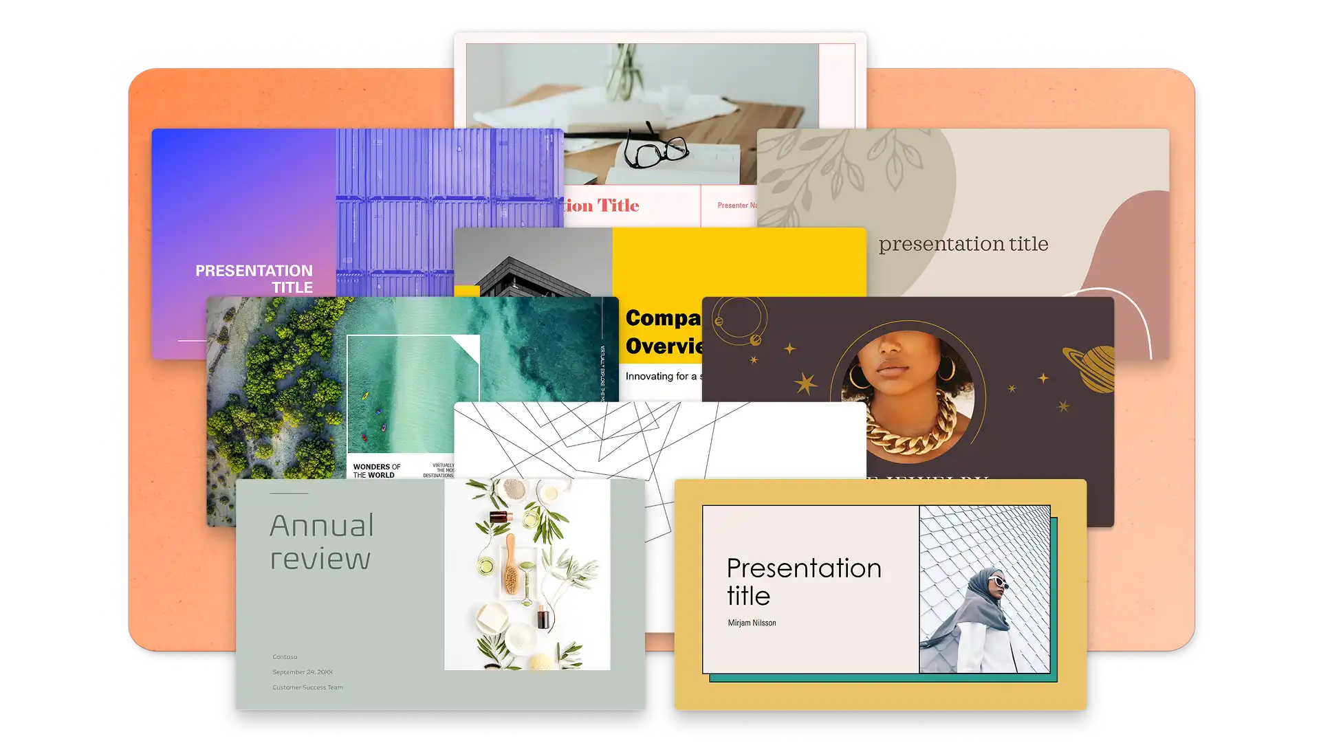
Let templates guide editing
Starting with a well-designed template can limit how much text fits on each slide, which naturally prevents overcrowding. Instead of cutting content manually, a professionally designed templates enforces this automatically. For example, these sales templates uses bold section headers and placeholder content that's easy to replace.
Browse PowerPoint presentation templates to find a starting point that match the goal of the deck, then edit the placeholder text, images, and charts to suit needs. Find investor presentations, marketing decks, finance slide templates, among other work presentation needs inside PowerPoint online.
Presentation data visualization tips
Focus each data slide on one key insight
Data slides should highlight a single insight that supports the narrative. If a chart needs a paragraph of explanation, it's doing too much. Focus each chart on one key takeaway. Highlight a specific data point or trend and create the visual around that.
Use color to direct attention
Color should direct attention, not be used as decoration. Highlight the one bar, line, or segment that matters most and keep the rest neutral or suited to the brand style guidelines. Consistent color styling across every chart in the deck means the viewers don't need to re-learn the visual language on each slide.
Choose chart types that match the story
Bar charts work best for comparisons. Line charts show trends over time. Pie charts (used sparingly) highlight proportions. Pick the chart type that makes the insight obvious to support viewers.
Label data directly on the chart
Text, labels, and data points also need to stay legible on large displays, laptop screens, and shared meeting windows. If a label can't be read without zooming in, consider simplifying the chart. These principles apply across sales presentation, financial review presentations, and performance reports.
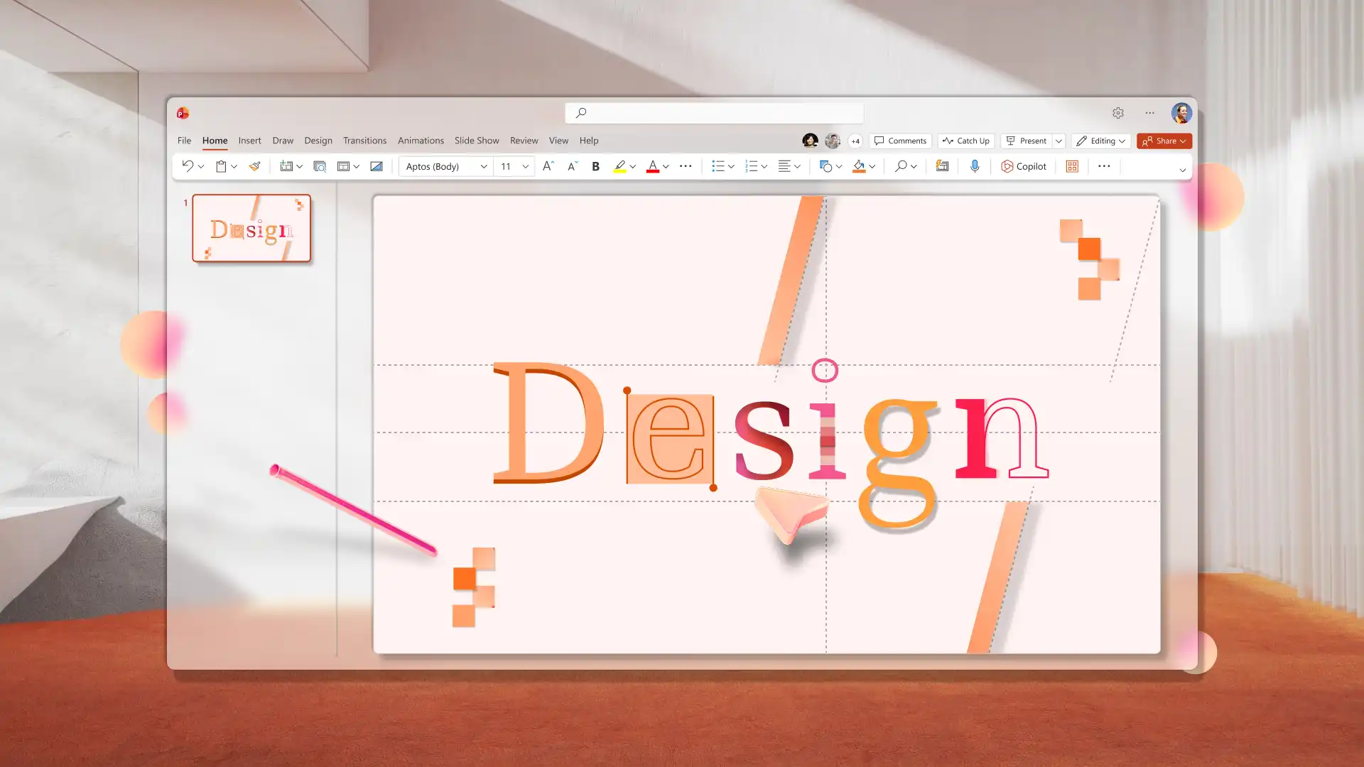
Presentation font styles and pairing tips
Choose fonts selectively
Typography sets the visual tone of a presentation before the audience reads a single word. Keep font choices simple and intentional. The most effective decks use one font for headings and one for body text. More than two fonts create visual noise and undercut a professional appearance.
Consider readability
Screen readability matters more than print aesthetics. Fonts that look elegant in a document don't always hold up on a projected slide or shared screen. Test fonts at presentation size, not just in the editing view.
Create visual hierarchy
Bold, semi-bold, and regular weights within a single font family create clear visual hierarchy without adding extra fonts. This keeps the design clean and consistent.
Pair fonts for impact
Three pairings that work well across PowerPoint decks:
Classic yet modern: Garamond (headings) paired with Calibri (body). Blends traditional authority with a modern, approachable feel.
Corporate standard: Arial Bold (headings) paired with Arial (body). Widely available, easily readable, and works across every device.
Clear and modern: Calibri Bold (headings) paired with Calibri (body). Clean, contemporary, and highly readable on screen. The default PowerPoint font, and effective for a reason.
These combinations suit portfolio presentations, brand style guide decks, and any context where typography needs to reinforce credibility.
For teams working from a brand style guide, defining approved fonts in the PowerPoint Slide Master keeps every deck consistent.
Presentation icon tips
Use icons to support structure, not to decorate
A well-placed icon helps the audience navigate a slide faster. Icons should label sections, highlight key points, or replace short text phrases. If an icon doesn't clarify meaning, remove it.
Stick to one icon style per deck
Pick one icon style and apply it throughout the deck. Mixing outlined icons with filled icons, or flat icons with 3D icons, creates visual inconsistency that distracts from the content. Try not to overuse an icon as it makes a slide feel busy.
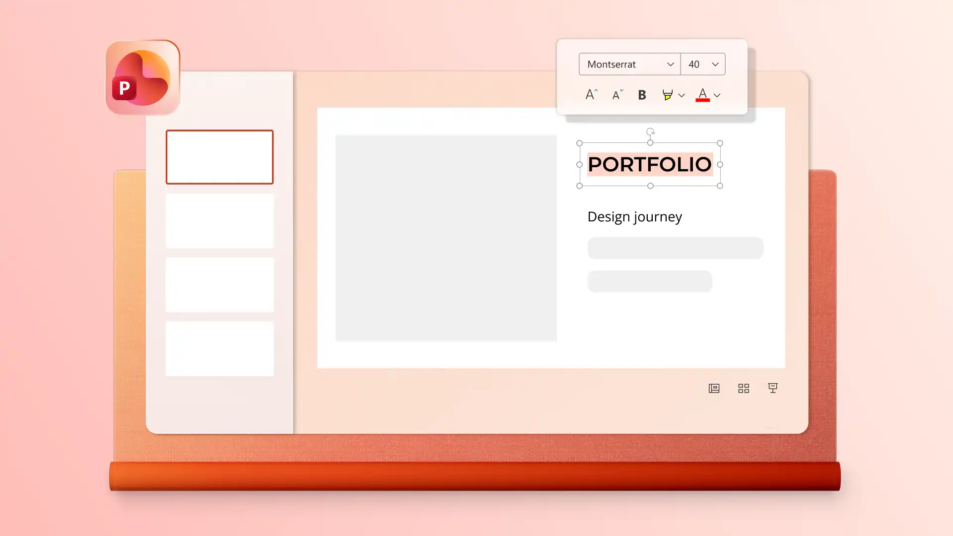
Title slide design ideas
Keep the title short and readable at a distance
The title slide sets the first impression for the entire deck. Aim for one clear headline that can be read from the back of a room or on a small screen. If the title extends to three lines due to text wrapping, it's too long.
Use one strong visual or none at all
A single image, shape, or color block works better than multiple visuals competing for attention. The title itself should remain the focal point.
Include only essential context
Add just what's needed for context: presenter name, date, company, or team. Avoid cluttering the title slide design with logos, taglines, subtitles, and extra text all at once. If it's not essential information for someone opening the deck, leave it off.
For more ways to engage audiences from the first slide onward, explore how to make an interactive presentation.
Executive summary slide design ideas
Structure for scanning, not reading
Break information into short bullet points or clearly defined sections. Small, easy-to-scan chunks help the slide land quickly, even when someone is skimming through the deck on their own time. Each point should be one line, not a paragraph.
Copilot tip: generate a presentation overview, slide-wise summary, or executive summary in the chat using the PowerPoint summarizer. Review the summary, then copy and paste into a new well-designed summary slide.
Use light dividers to separate sections
Light icons or simple horizontal lines help separate sections without distracting from the content. These visual cues speed up scanning and give the slide a more organized feel.
Layer accent color background
Try using a subtle background shade or accent color to frames the executive summary slide design and visually separate it from the rest of the deck. Avoid strong, saturated colors that compete with the text. The content should be the focus.
Thank you slide design ideas
Minimal and clean
Keep the slide layout focused with minimal text to leave a professional impression. There’s no need to present new information or a summary. A clean layout with minimal text feels more professional than a busy closing slide which shares every contact detail and social handle.
Add clear next steps
Include what happens next: an open question session, a scheduled follow-up, or a direct way to get in touch. Adding an image of the presenter or contact person makes the closing slide feel personal and approachable, which is valuable in sales presentation and marketing presentation contexts.
Curate a polished visual
The thank you slide design should feel like a confident, clean ending. One well-chosen visual element, like a subtle shape or brand logo, can add finishing touches without cluttering the slide.

PowerPoint design trends in 2026
Minimalist vs maximalist slide design
Clean layouts remain popular in 2026, but the style has evolved. Warmer tones, softer shapes, and intentional accent colors have replaced the plain white slides of previous years. Slides now need to work across three contexts: live in a room, in emails and shared links, and on-the-go on a mobile screen.
The right approach depends on context. Internal planning, reporting, and stakeholder presentations do well using minimalist slide design as the goal is information clarity. Marketing decks, product visions, or keynote slides can choose a bold slide design to capture attention.

Custom AI images for presentations
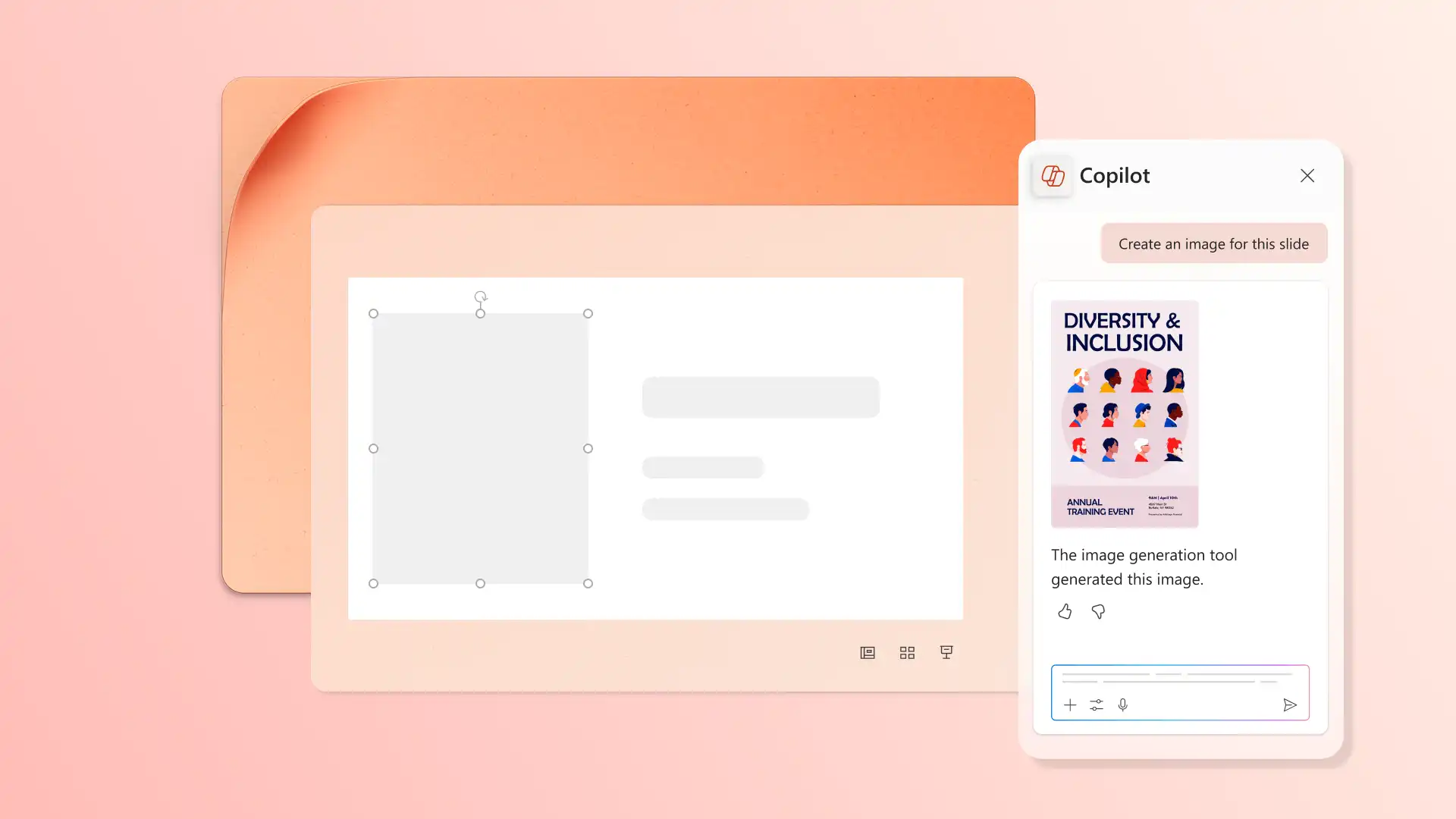
AI-generated images using Copilot in PowerPoint can help personalize a presentation effectively. For businesses and brands with limited imagery available, searching through stock images was the best option to represent topics and ideas in a deck.
Now, simply by describing image and illustration needs with Copilot, presenters can generate exactly what they need for review in the chat, then download and choose the best placement on slides. AI will also help select the visual style, such as photographic, illustrated, 3D, or abstract.
Copilot tip: generate visuals that match a specific concept, tone, or mood using descriptive language, such as “create an artistic image to represent a new employee’s onboarding journey like climbing a ladder with joy.”
3D image and icon design style
3D visuals have moved from novelty to mainstream presentation design style. 3D icons, illustrations, and objects add depth and dimension to slides, giving it a modern feel that fits professional presentation needs.
To generate 3D visuals, describe image, infographic, or slide background needs to Copilot in the chat, then answer follow-up questions to create the ideal visual. Download files from the chat, and insert it on a specific slide.

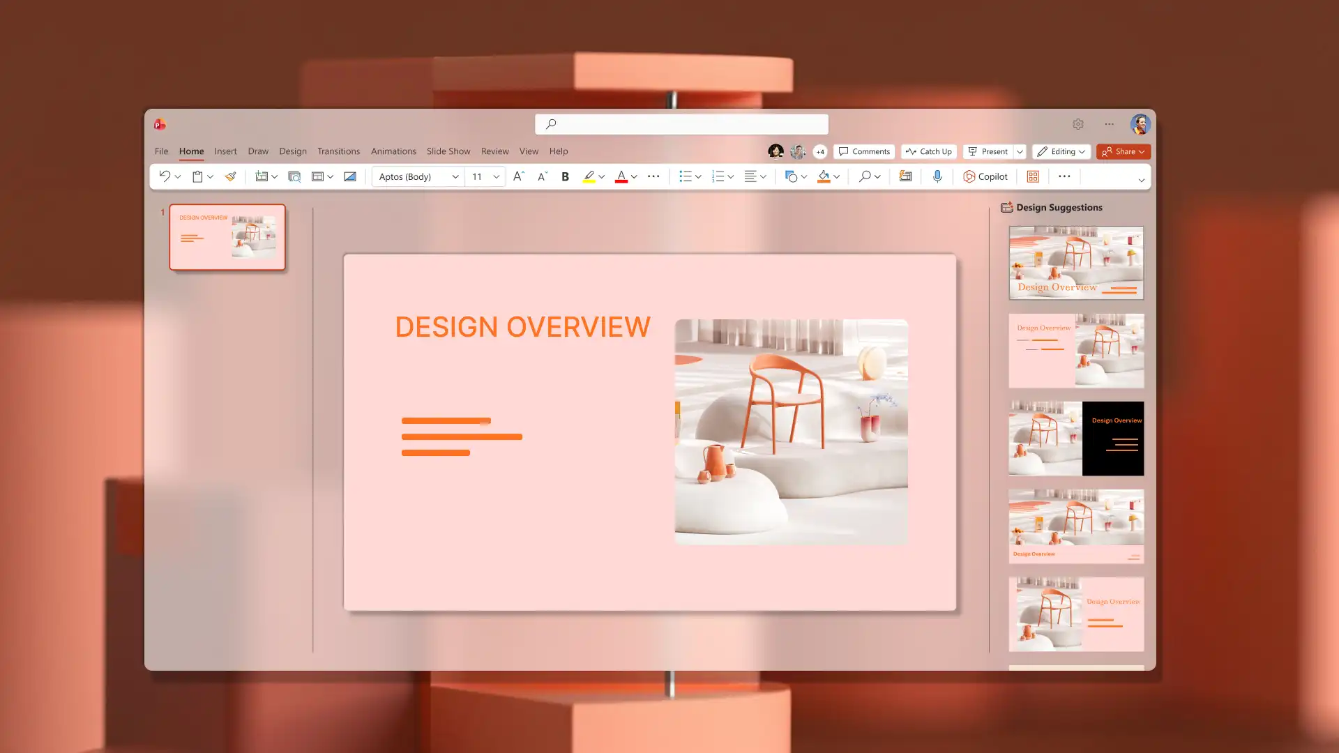
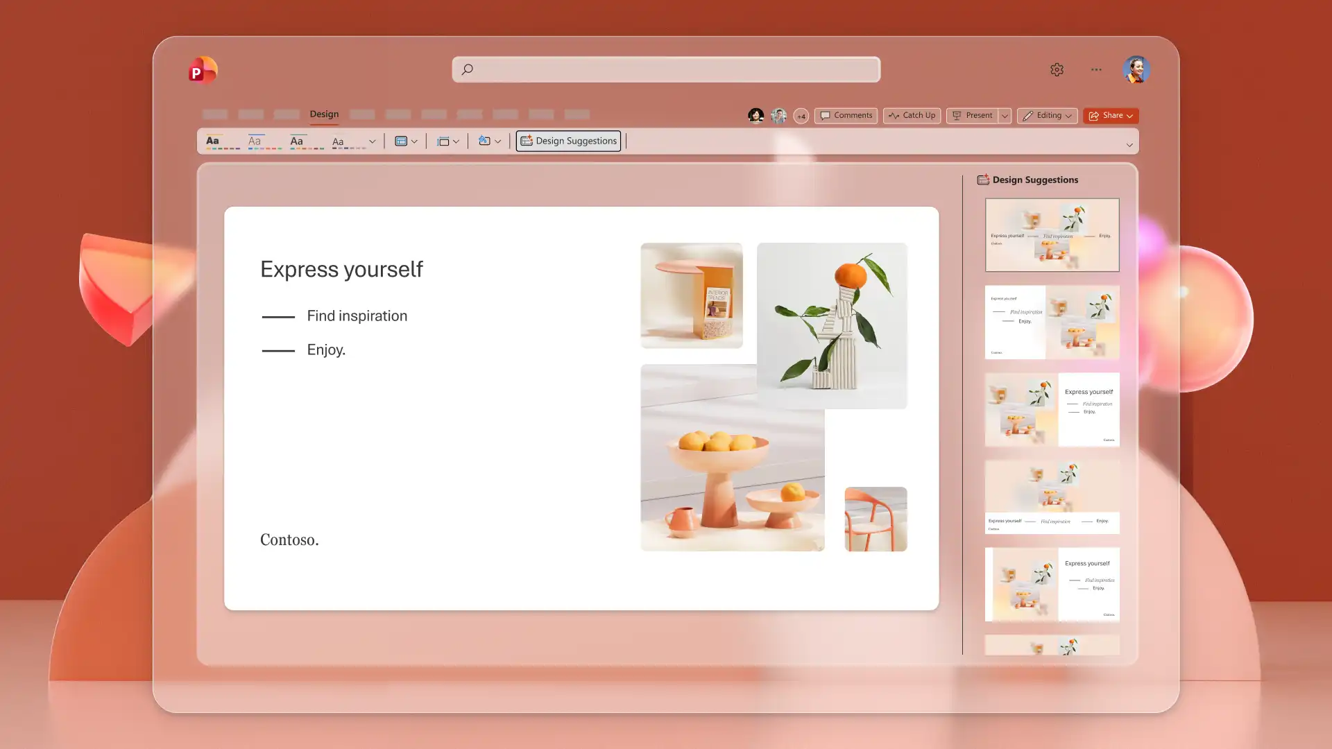
AI design suggestions in PowerPoint
Showcase slide content with impact using the Copilot design suggestions pane. Browse layout variations with different text and image placements that enhance plain slides. Simply click to apply the new slide structure.
Communicate ideas clearly with engaging slide designs and AI-powered workflows in PowerPoint. Create a presentation from scratch with these good design principles and tips, choose a PowerPoint template, or try the AI presentation designer to build polished slides.
To learn more ways Copilot can help, explore how to make a presentation with AI and how to convert a PDF to PowerPoint with AI.